
By Eric Collins, Co-Expedition Principal Investigator, University of Alaska Fairbanks
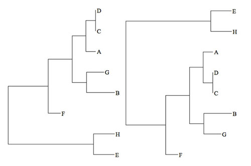
Figure 1: Two visualizations of the same phylogenetic tree. Image courtesy of the Mapping the Uncharted Diversity of Arctic Marine Microbes expedition. Download larger version (jpg, 17 KB).
The primary goal of this project is to identify new microorganisms from extreme environments in the Arctic which are subject to rapid change as a consequence of global warming. That sounds straightforward, but how do we actually identify whether the microbes we find are new or not? To do it, we first need to know what is already known.
In our case, there are several databases containing marine DNA sequences online that contain thousands and thousands of barcode sequences that other researchers have already found. The database we’re using is called SILVA, and it contains quality controlled sequences encoding ribosomal RNA genes, which are crucial for all life on Earth. The complete database has 4,985,791 DNA sequences! Not all of those sequences are unique, though – when we merge all of the sequences that are at least 99 percent similar, we end up with 597,607 sequences. Still a lot!
Because there is not a direct correlation between microbial ‘species’ and sequence similarity, we usually use a cutoff of 97% similarity to determine if two bacteria are the same ‘species’, even though we know there is a lot of diversity within species as well. So even this abbreviated collection contains multiple sequences from each ‘species.’ I should note that I put ‘species’ in quotes here because, surprisingly, microbial ecologists don’t yet have a good definition for what a bacterial ‘species’ is, which makes us squirm a little when using the term. Sometimes we hedge and say ‘operational taxonomic unit’ instead, but that’s quite the mouthful, isn’t it?
After we have our SILVA database, the next step is to compare our new sequences to the database and find out how well they match. A typical approach involves calculating the genetic distance between every new sequence and every database sequence, and then plotting them on a phylogenetic tree (see Figure 1).
In a phylogenetic tree, the vertical distance is just for spacing and the horizontal distance along the tree represents evolutionary distance; the branching pattern represents evolutionary divergence (e.g., speciation) among the microbes, here represented by their DNA barcode sequence (A-H). In the tree on the left, we see that sequences ‘D’ and ‘C’ are close to each other and have essentially no horizontal distance between them, which means they are very similar, perhaps identical. On the other hand, sequences ‘G’ and ‘B’ share a common ancestor, and so are more closely related to each other than to any other sequences, but they are still quite divergent compared to ‘D’ and ‘C,’ for example.
The tricky part about phylogenetic trees is that they are difficult to read, even for specialists. For example, the tree on the right looks very different from the tree on the left, but, in fact, it’s horizontal branching patterns are identical; only the order in which the branches are arranged on each tree is different! Despite its usefulness in showing the relatedness among the microbes, this ‘tree isomorphism’ problem can make interpreting phylogenetic trees difficult, especially for non-specialists.
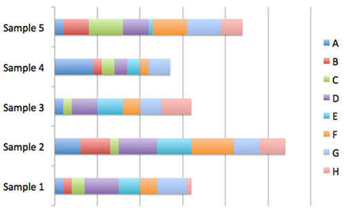
Figure 2: Example of stacked bar charts. Image courtesy of the Mapping the Uncharted Diversity of Arctic Marine Microbes expedition. Download larger version (jpg, 31 KB).
Another way that microbial community data is often presented is via stacked bar charts (Figure 2). In this representation, we can see how many representatives of sequence ‘A’ were present in each sample, but we’ve now lost the information showing the evolutionary relations among the different microbes (A-H).
For this NOAA Office of Ocean Exploration and Research project, we’ve invented a new visualization that tries to reconcile these problems, in order to present both evolutionary relatedness and sequence abundance in a way that is intuitive for experts and citizen scientists alike. In the true spirit of exploration, we’ve devised a mapping system to allow active exploration of the diversity of the microbial world. We call it SEDNA, in honor of the Inuit goddess of the sea. Sedna is also the name of a recently discovered minor planet beyond Neptune, signifying the exploratory nature of both worlds. You can preview SEDNA now at: http://cryomics.org/sedna . Happy exploring!
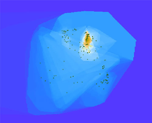
Figure 3: A cluster of bacterial sequences dominate this Arctic seawater sample. Image courtesy of the Mapping the Uncharted Diversity of Arctic Marine Microbes expedition. Download larger version (jpg, 30 KB).
In the map shown in Figure 3, you can see an island surrounded by a blue ocean. The island represents a cluster of bacterial sequences that dominate this sample, which is from Arctic seawater. If we zoom in (Figure 4), we can see that the island peak is dominated by a large group called the Gammaproteobacteria, which are very common in seawater. If we zoom in even further (Figure 5), we can see that the peak corresponds to bacteria related to Vibrio, which are prototypical seawater microbes. These sequences are quite close to known sequences from the SILVA database (about 10 miles in Earth-distance), so these are probably not new species.
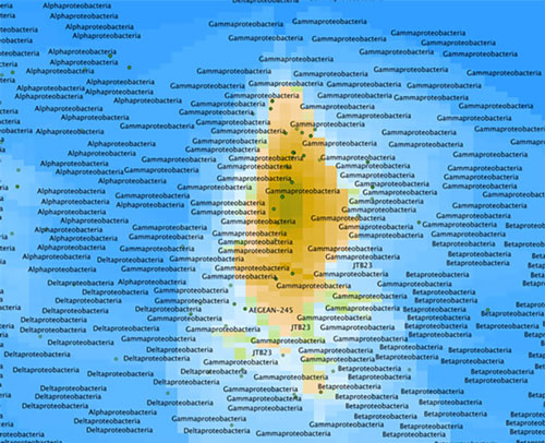
Figure 4: Zoomed in view of map from Figure 3 showing the seawater sample is dominated by a large group called the Gammaproteobacteria. Image courtesy of the Mapping the Uncharted Diversity of Arctic Marine Microbes expedition. Download larger version (jpg, 151 KB).
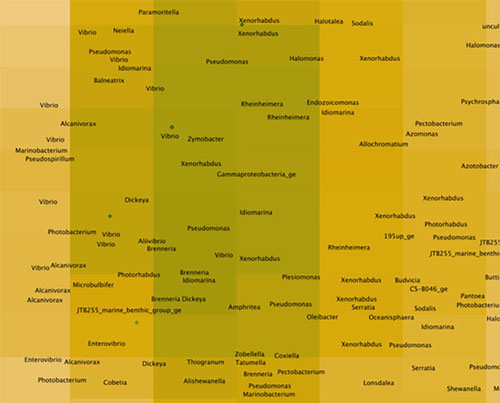
Figure 5: An even closer look at the map in Figure 3, showing that the peak corresponds to bacteria related to Vibrio. Image courtesy of the Mapping the Uncharted Diversity of Arctic Marine Microbes expedition. Download larger version (jpg, 58 KB).
Now, if we look at another sample (Figure 6), we can immediately see that it is different than the first sample. In the case below, the sample is from a nearby station at the same depth, but there was a phytoplankton bloom in progress. We can see that the Gammaproteobacteria are still present, but less prominent. If we zoom in (Figure 7), we see that there is a concentration of sequences further south. The nearest neighbors to these sequences in existing databases are actually quite distant (represented by small red dots). These closest neighbors are sequences from tiny microbes from a new phylum called “Candidatus Saccharibacteria” (formerly Candidate Division TM7), but they are about 100 miles in Earth-distance from any known Saccharibacteria, which means that we have likely discovered new species! This will definitely be something to follow up on with more rigorous techniques.
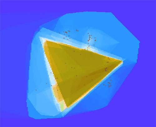
Figure 6: Bacterial map of another Arctic seawater sample. Image courtesy of the Mapping the Uncharted Diversity of Arctic Marine Microbes expedition. Download larger version (jpg, 37 KB).
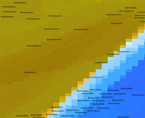
Figure 7: A closer look at the map in Figure 6. Image courtesy of the Mapping the Uncharted Diversity of Arctic Marine Microbes expedition. Download larger version (jpg, 45 KB).